The autumn in this film was never painted
Every leaf in this valley was painted green. What turns it gold is a curve, a mask and eight seconds.
One summer painting
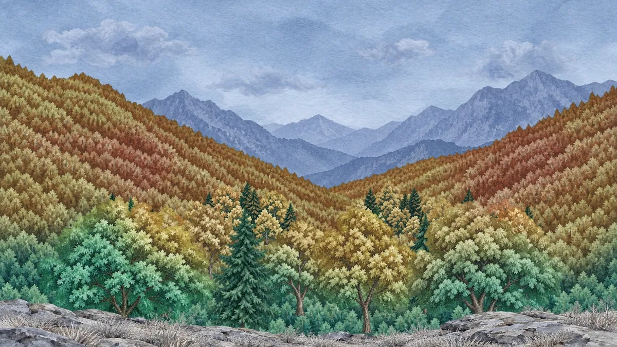
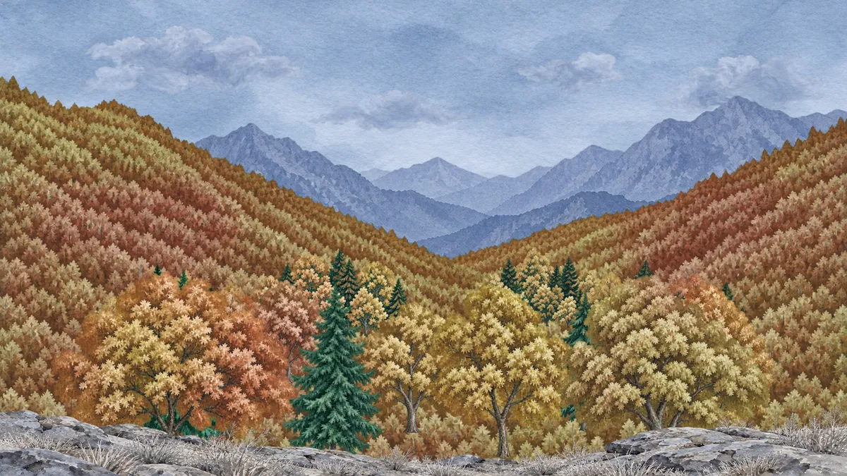
A valley in high summer, every tree on it green. Autumn starts on the ridges and comes down the slopes until it reaches the trees at your feet, and the whole picture warms as it arrives. There is no second painting of the autumn valley, and no frame was retouched.
Colour grading can do this, but the part that makes it work happens well before any grading: the picture has to be made with the grade in mind. This post is about what that asks of the painting, how the curves and masks work together, and where a grade runs out.
Exported from the Keyframe editor as it is. Twelve seconds, no sound.
Why not paint the autumn too
The obvious way to change a season is two pictures and a transition between them. But a wipe only looks like a season if the two pictures match tree for tree, and a dissolve looks like a dissolve. Painting a second valley that lines up leaf for leaf is the slowest possible way to get a result that still reads as an edit.
A grade has the opposite property. It cannot move a single brushstroke, so the summer and the autumn line up perfectly by construction. And because it is only numbers, the moment a tree turns can be different for every tree, and can be changed on the timeline without touching the painting.
Hue vs Hue moves colour, not paint
The tool is a Hue vs Hue curve. Adobe’s guide to the same curve in Premiere says it lets you select a hue range and change it to another hue (external website, opens in a new tab); every other colour is left where it was. Keyframe has it in Lumetri Color (opens in a new tab). The light and dark of each stroke survive, and only its hue moves.
Here it runs on adjustment layers (opens in a new tab), not on the forest itself, so one grade covers every tree in the stack. There are two curves. The first takes the greens to gold and orange. It also lifts their saturation and brightness as they turn, because the same paint that reads as a rich green turns muddy brown at the same lightness. The second takes some of that gold further, to red.
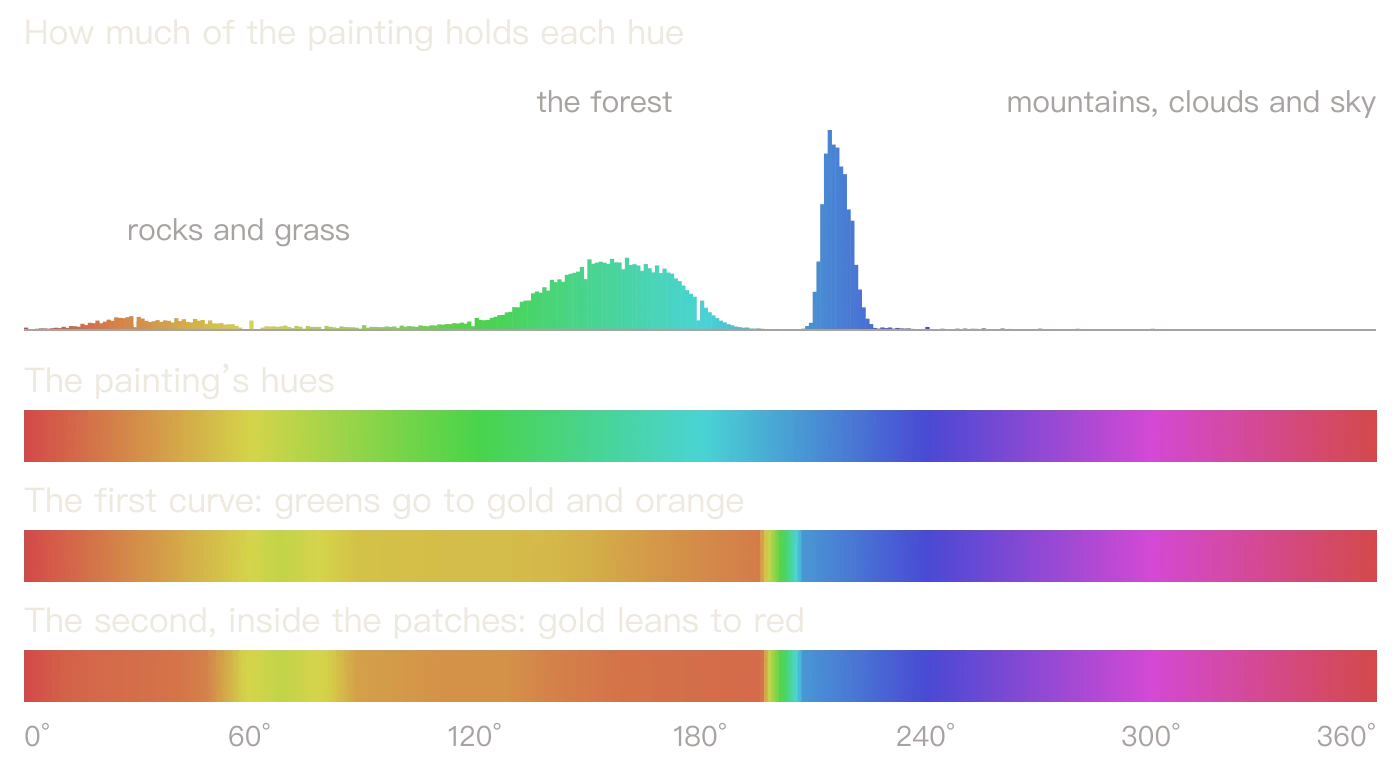
The chart below is the whole trick, measured from the painting. The forest is one hump of hue; the mountains and sky are another, some thirty degrees away. The curve can rise in the first and be flat again before the second, so autumn cannot reach the sky even though it is the same adjustment layer over the same frame.
- Where the painting’s hues lie, and where they go
The grade was decided when the picture was ordered
That gap between the forest and the sky is not luck. It was in the brief for the painting: every leaf between 110° and 195° on the hue circle, no yellow leaves, nothing that reads as autumn already, firs clearly darker than the broadleaf trees. A single yellowing tree in the summer picture would have sat outside the curve and stayed yellow-green while the hill around it went red.
The brief also asked for flat, overcast light with no direction to it. Sunlight painted into the leaves is yellow on one side and blue on the other. Those are different hues, so the curve would have sent them to different places and the lit side of a tree would have turned a different colour from its shade.
A brief is not the same as the picture, so measure what comes back. Small pale strokes on this slope sit around 90° to 99°, and a curve that began above them would leave them thin and green against the autumn. So the curve starts at 68°, still clear of the browns of the trunks. If you are grading a picture you did not order, measure its hues first: the scopes will tell you whether there is room.
A curve spread too wide stripes the hill
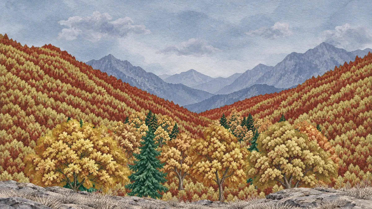
For a rich autumn, the natural move is to spread the forest’s greens widely over gold, orange and red. On near trees that works. On a slope it draws stripes. This painting’s slope is rows and rows of small trees, and in those rows dark paint sits at a much bluer hue than light paint, around 170° against 140°. A curve that spreads hue widely therefore gives each row its own colour, and the hill comes out in red and gold bands that belong to the painting’s brushwork and to no forest.
- The wide curve
- The narrow curve and the patches
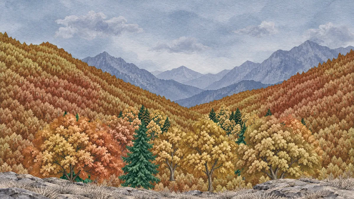
So the job splits in two. The first curve stays narrow, so the rows land close together in gold and orange and stop arguing. The red gets a reason of its own, one larger than a tree: the second adjustment layer reads its strength through soft Fractal Noise (opens in a new tab) several trees across, and the red arrives in drifts across the slope and across single crowns, the way a real hillside turns in patches. The rows still show if you look for them, but they read as trees now, not as stripes.
A front that comes down the ridge
Each adjustment layer has a mask (opens in a new tab), and the autumn is whatever is inside it. The mask’s lower edge starts just above the ridges and is keyed down the frame over eight seconds. Its shape is not drawn by hand: the build reads the top of the forest from the painting’s own alpha, column by column, smooths it, and adds a little unevenness that changes as it falls, so the edge follows the slope’s lines instead of crossing them as a level wipe. The edge is feathered forty-four pixels, which is what turns a wipe into a season.
The red layer’s mask runs the same path forty frames later, so a tree goes green, then gold, then red. Once the valley has turned, a third adjustment layer over the whole frame takes the white balance from cold to warm, and the grey sky and rocks finally share in the change.
- Two seconds
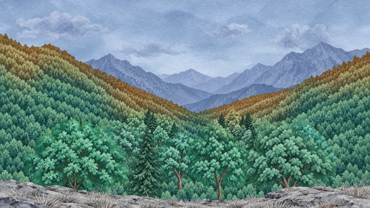
- Four seconds
- Seven seconds
The firs stay green because a matte moves with them
Firs do not turn, and a valley with no evergreens looks dyed, but their greens sit in the same range as everything else, so no curve can tell them apart. That job goes to a luma track matte (opens in a new tab): the adjustment layers only act where the matte is light, and the matte is a second composition holding the whole forest again, with the firs set to black and the rest to white.
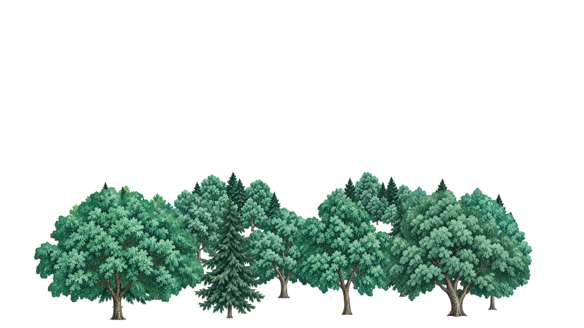
The trees in that second composition carry exactly the same motion as the real ones. If they did not, the fir’s protection would slide off the fir the moment the wind blew. Firs inside the mid-ground clumps are picked out by how dark they are instead, because they are painted into a layer with their neighbours. It costs a duplicate of every moving tree, which is the price of doing it without touching the paint.
Trees have to lean, not slide
A still painting with changing colours looks like a slide, so the trees had to move. The easy way is scrolling noise through Displacement Map (opens in a new tab) over the whole forest. Frame by frame it looks fine; watched closely it looks like jelly. Pixels slide about, one crown never passes in front of another, and each tree wobbles back and forth rather than leaning into the wind.
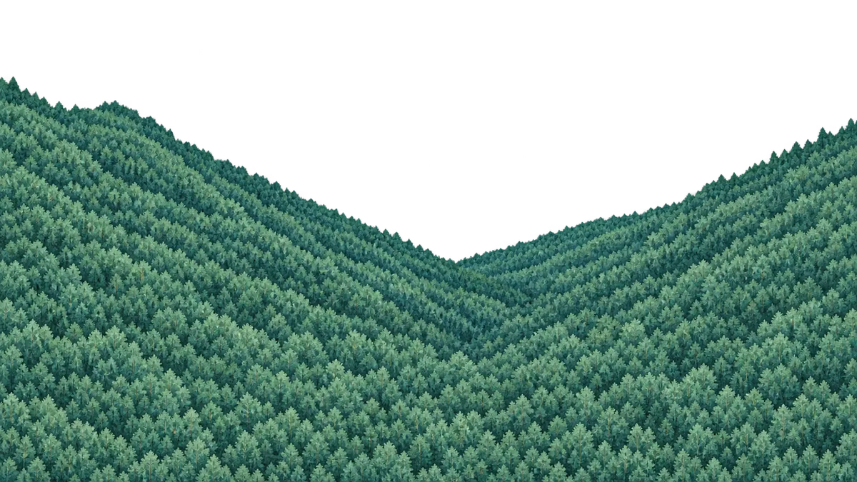
So the near trees need layers of their own: fourteen near trees and four mid-ground clumps, each on its own layer, over a slope painted complete behind them. Each near tree has a mesh (opens in a new tab) with handles, held at the root. Its lean comes from a damped spring pulled toward the angle where wind and stiffness balance, so when a gust arrives it leans, overshoots once and settles, with the crown a few frames behind the trunk and a small tremble on top. The gusts cross the frame from the left, so the left of the valley moves first and the right follows about a second later.
- The slope
- The trees that stand on it
The distance cannot stand completely still either: with the front trees moving and the slope behind them fixed, the back half of the world looks frozen. There are far too many trees up there to rig, so the slope is where a Displacement Map belongs, limited to about eleven pixels at most and driven by a map that frees each crown’s top and holds its foot. Games have long handled distant plants like this; the Crysis team’s chapter in GPU Gems 3 splits the same problem into a main bend and detail (external website, opens in a new tab), and warns that too much bending ruins the illusion. It is still a warp, and it holds because nothing up there is big enough to show it.
What a grade cannot do
It cannot change the light. Real autumn comes with a lower sun and longer shadows, and this valley keeps its flat overcast day from start to finish, because that is what let the curve work. It cannot change what is there either: no leaf falls, no crown thins and no branch shows through. Up close the trees look like green trees in gold clothes for a moment before you stop noticing.
The rows on the slope are still visible, and only a new painting would remove them. The matte’s second forest makes the project heavy, about a hundred megabytes, most of it keyframes for the wind. A pale tree or two came out closer to salmon than to orange, since a hue curve has little to work with where the paint has little colour. And the far slope’s sway is a side-to-side shimmer, not a lean, so it does not quite match the trees in front of it.
Leave room in the paint
Grading is usually treated as the last thing that happens to a picture. For a change like this it is the first: decide which hues will move and which must stay still, and keep them apart while the picture is being made. After that, the season is a curve and a mask, and you can move it with your mouse.
The post on a moving light makes the same bet with a different quantity: one flat picture, with the light computed over it.